
CHOOSING YOUR COLORS
I have an odd obsession with colors! It's equally as exciting finding colors for a brand as it is doing interior design for our real estate clients and helping them choose their colors for their rooms. I mean, really, a color can make or break a room! Let me ask you a question we all know all too well, what really sets a home a part from one that sits on the market for a long time and is outdated compared to a home that has been brightened up? Paint colors! It makes a world of a difference, and the same can be said for your brand when it comes to using certain colors.
As it is with paint colors, brand colors go through the seasons of trends as well. Here are the top brand colors for 2017:
PASTELS & SOFT SHADES FOR THE WIN IN 2017
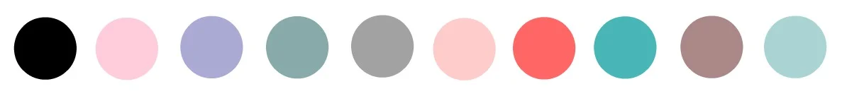
ALSO TRENDING:

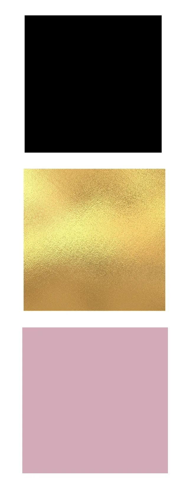
GOLD & GLITTER, YAY!!
Now I recommend always picking 2 color combos (white isn't included in that count) and 3 max. Right now, simplicity in logos and brands go much further in marketing, so you'll want to be sure to stick to 3 max. As you'll see with LRE Social, our 3 colors are black, pastel pink, and gold. Here are a couple of color combos that work great together and are trending:


COLORS TO AVOID - YUCK!
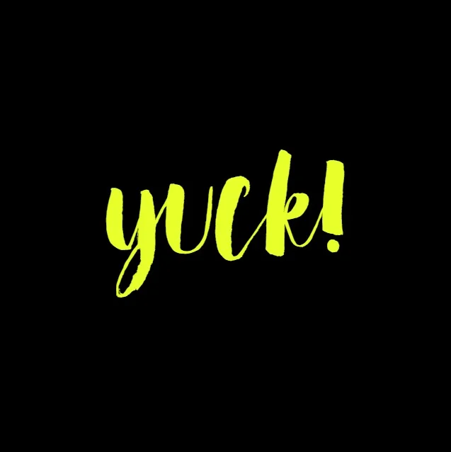
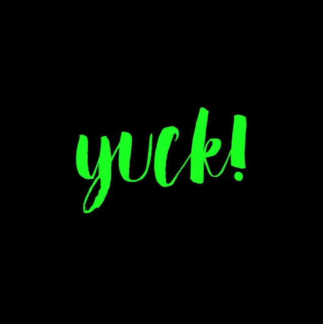

Run, hide, quick! From neon colors! They "can" be pulled off, but are difficult to do so without making it difficult on the eyes. And when choosing your colors, be sure you're mindful that they look well together on a handful of different marketing items and overlays. Don't over complicate the colors! Choose one super dark shade, a medium shade, then a light shade. And tada! You'll be set!