
YOUR FACEBOOK COVER
I'm always surprised when I see Facebook cover photos go to waste. I absolutely love the ability to create cover photos on Facebook, it helps me to really showcase my brand identity. Yet often times with real estate agents, you look at the cover photos and it's just some random image of a house or a terribly blurry photo, with no thought process put into it.
Aside from your profile photo, your cover photo is the first thing people see when visiting your page. Does your cover photo scream to hire you at first glance? Or to become a follower on your page? If you want success on social media, you'll have to dot your i's and cross your t's and that includes making sure your cover photo speaks your brand's story.
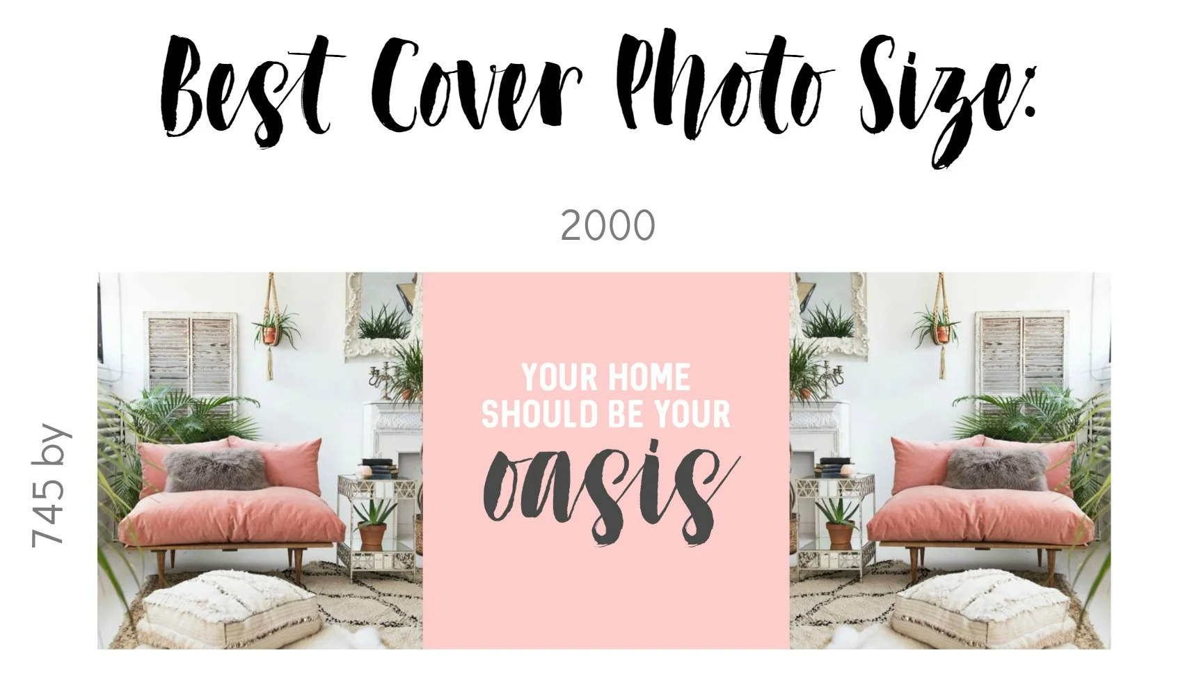
To start, you'll want to ensure your cover photo is a large enough file that will look clear and pretty on both mobile and desktop. The best size is 745 x 2000. Because of the layout of mobile, you want to get your text as close to the center as possible, doesn't have to be directly in the middle, but just ensure it isn't too far to the left or right, because mobile will crop it out.
There are 2 types of cover photos I recommend doing. One with a call to action to either contact you or follow your page. Or 2, a vibrant one with overlaid text, that expresses your brand's theme.
CALL TO ACTION

VIBRANT BRAND

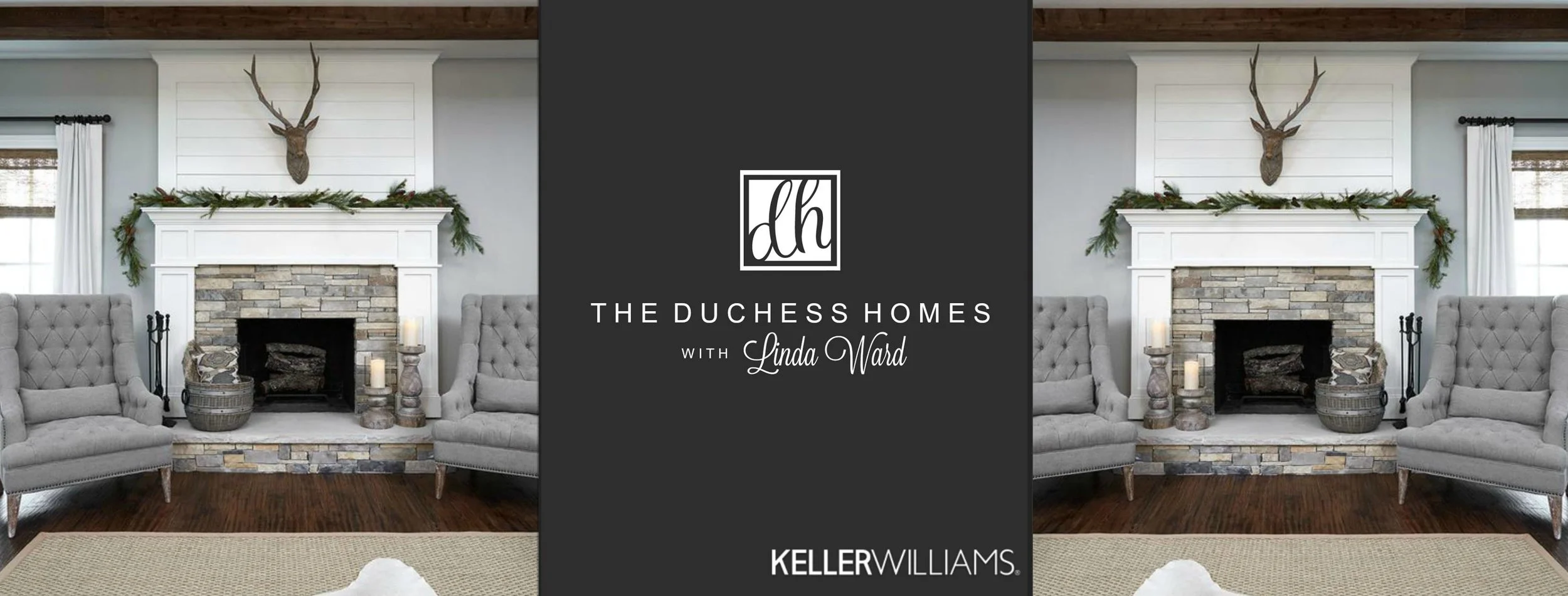
As discussed in the last module, you'll want to use your brokerage's logo in your cover photo, not the page name itself. I've attached an example of how to put one together with a broker's logo, below:
Utilize your cover photo to give you the best boost for your Facebook presence. I have a blast creating mine, and I want you to do the same! Be sure to change out your cover photo every 1.5-2 months, and be sure to liven it up with a temporary festive one for each holiday. Like the cute one below: