CREATING A LOGO
Your logo is one of the most powerful tools of your branding. It will (should) be on absolutely everything, and you want it to become the statement piece for all of your marketing. At first glance, a logo looks like a simple design, but there is so much that goes into the creation of one. There needs to be a thought process to ensure it expresses the brand you want in the right way. I'll break down the anatomy of a great logo below, and I'll show you, in the video below, a quick way to make one on your own.
SET THE RIGHT TONE:
This is where you're going to want to take into consideration the theme we discussed. Do you want to mold your logo around a luxury brand, a modern brand, a chic brand, etc.? Layout a collage of images (you can find them on Pinterest) and let them help you to see your logo vision. Before I start any new brand, I always use Pinterest as my guiding point, and make a mood board. I put together images I know will help me express the brand I want, and get inspired by fonts & colors that I see. This helps me not only pinpoint the niche and theme I'm going to work on, but ensures I get a logo design out of it that I love!
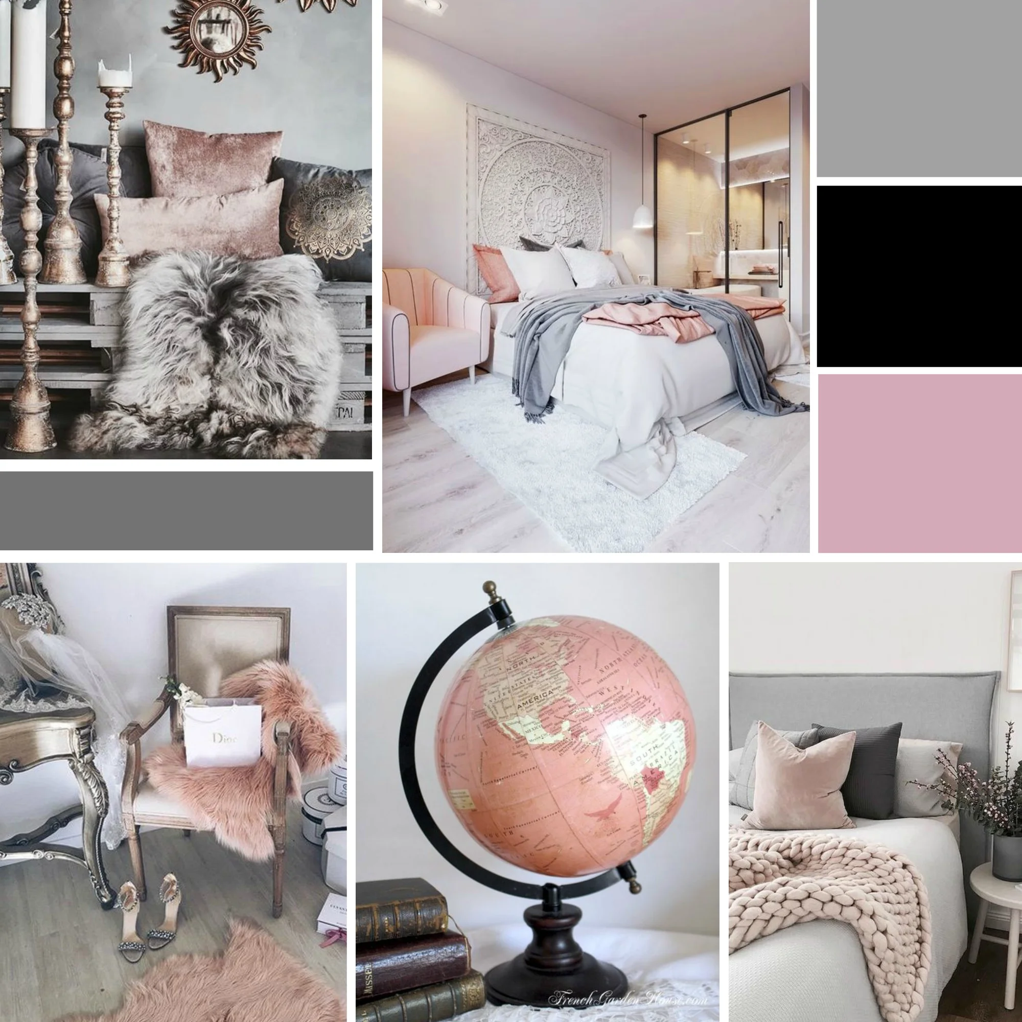
YOUR COLORS:
This is where you'll want to incorporate the color rules that we discussed in module 4. A maximum of 3 colors, and you want to ensure the colors blend well together, and avoid neon colors. Make sure your color pallet is consistent, makes sense for your theme, and is easy on the eyes. You'll want to take these colors and incorporate them throughout all of your branding, so be sure to save the names & hex codes of each color. A hex code is the number digits of a color, this can be easily found with a quick Google search. For example, the color black is #000. Most hex codes are going to be 6 digits.
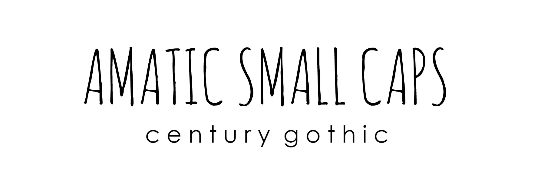
YOUR FONTS:
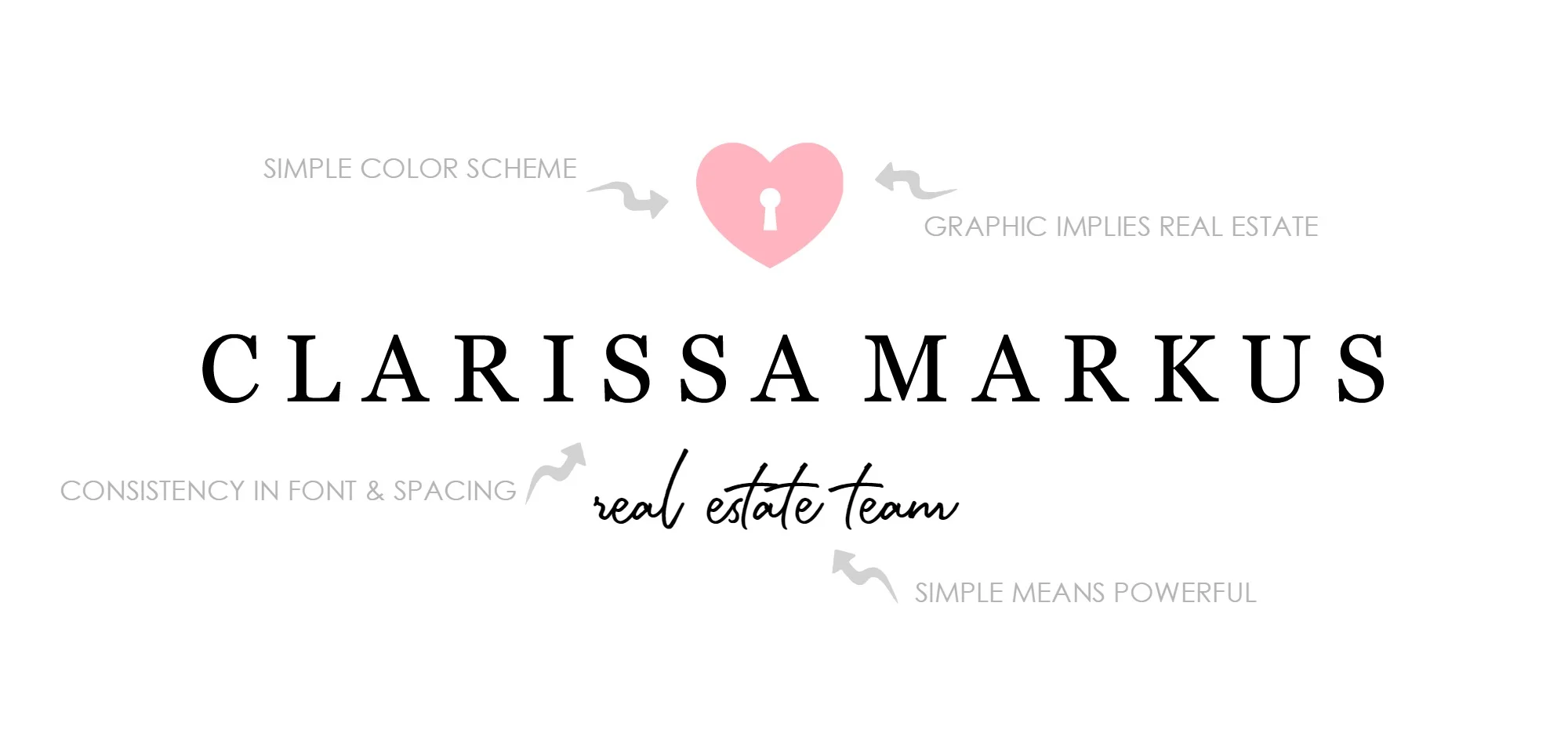
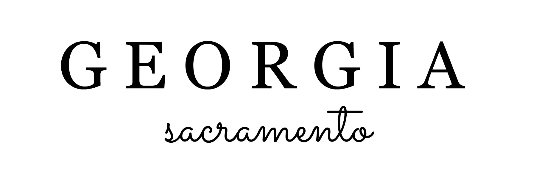
Another important factor of your logo is the font. What do you want the font to say to the consumer? Does it say modern and simple, does it say playful and chic, or does it say luxury and class? There are hundreds of thousands of fonts to choose from, which can make the process of finding the right one a little overwhelming. Below you'll find a few of my favorite fonts to use in branding, but a general rule of thumb for logos are: no icon - make the name font stand out, with a clean tagline font. If you do have an icon, make the name clean, and add creativity to the tagline. Now when you pick these fonts, be sure you use them in ALL of your marketing, including your website, consistency in fonts DOES matter. It'll help tie in the brand throughout your material.

CREATIVITY:
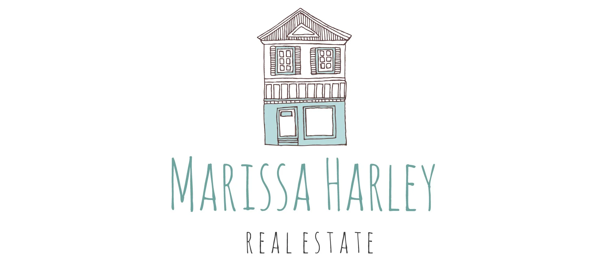
Please, I am begging you not to use the generic looking house logo almost every single real estate agent has. Stand out! That's not to say don't use a house graphic, but just make sure it's not the same one we see all of the time, consumers get so used to it, they start to look over it because automatically it associates us with spam. Now if you have a clean logo, that's different, it's going to catch their eye and draw interest. "Oh, pretty logo, let me check her out..." type of interest.
PLEASE, NO!

THAT WORKS!
And if you have a logo that's pretty generic and you want to get it changed out, you can get one from our templates, hire a professional, or watch our quick tutorial video on how to make one yourself. Even if you aren't a graphic designer, I'll show you how to get something beautiful for super quick!